Designing And Implementing A Winning Logo For Your Brand
Looking to create a logo for your business, or looking to find out how to put an existing logo design on a product? You’ve come to the right place. Logos are very intentional despite their simple look. It can take 100 design variations to get to that final one. Keep in mind these style rules, and ensure that your logos can be used on all mediums.
The word “logo” get’s thrown around a lot as it can be all encompassing. Understanding the look you want is important, and there are specific names for the different types.
Logo – a symbol or other design adopted by an organization to identify its products, uniform, vehicles, etc.
Watermark – a faint design made in some paper during manufacturing that is visible when held against the light and typically identifies the maker
Lettermark – typography-based logo that’s comprised of a few letters, usually a company’s initials
Wordmark – a distinct text-only typographic treatment of the name of a company, institution, or product name used for purposes of identification and branding
Developing the idea.
When developing a brand, think of it as a person and define the five senses. A logo can be considered the sight or visual aspects of the “person” or brand. Just how you recognize your friend by their face, the logo of a company is the same. The design and color scheme of the logo will represent who you are as a business. Think of it as a “window to the soul” like the eyes are.
One of the first routes businesses tend to go is designing the wordmark or lettermark. The wordmark is the name of the company in a specific font. The lettermark is an abbreviation of a company’s name. Both can be edited with design elements to make them more distinguished.
Design elements can be anything that alters the text or a creative puzzle piece in the logo. For example, the Fed Ex wordmark has an arrow between the “E” and “X.” Coca Cola extends the “C” above and below the cursive font to add to the fluidity. Adding a hidden visual element or guiding eyes with the typography is a genius move.


The logo is the symbol of the company. It should be simple enough that anyone can replicate it from memory. It should also represent what you do. Since Nike first started out making running shoes, the swoosh was designed to demonstrate movement and was inspired by a track. Each popular brand has a rich history behind its logo. Be creative, and strive to emulate the history of your company. Even if you are just starting out, you have a message!

What makes a winning logo?
For any of the logo types, simplicity is key. It should be easily recognized and the color is very important. Every business must be able to have their logo type look good in black and white. Even if your company plans to make your print and digital assets in color, someone else outside of your organization could print it without. Then a design made only in color isn’t recognizable. That’s not what you want.
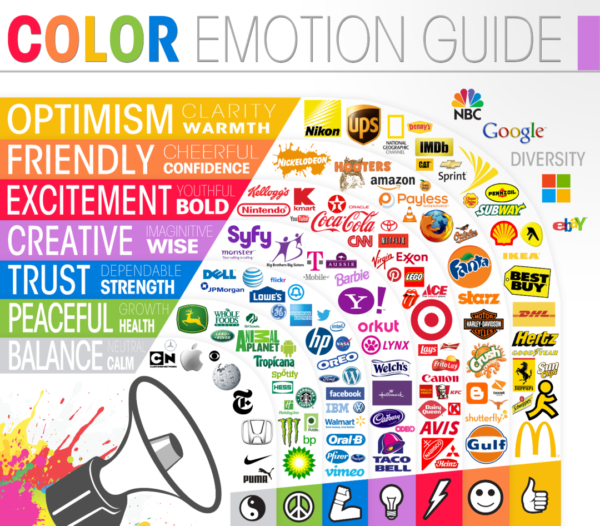
For color, you should only use one or two. Using more than two can get messy and cause confusion. You want your primary color, secondary color, then the accents which are black and white. The colors you choose give off a personality. Red can come off as harsh, angry or loving. Blue is often professional, calming or cold. Each color has something to say, so make sure you are sending the right message with your branding.
There can be exceptions to this as well. In the business world, blue is a popular color. Going for something not frequently used to contrast the blue sea could help you stand out. Try orange or purple if that can resonate well with your company.
Make sure your logo is scaleable, this goes along with it being simple. Intricate designs won’t look good when they need to be the size of a penny. Designers know this, but Illustrator is vector based. It’s not based on pixels like Photoshop. Meaning, you can scale items to be large or small and the they won’t be altered. Export designs as a png file, and use png for all branding needs. It offers a transparent background and isn’t pixel based.
Putting them to use.
The different logo types can have different uses. Watermarks are used for print when you need a light, almost transparent company name on something. They are mostly used in signing banknotes, passports, or envelopes and stamps. Usually they are used to prevent counterfeiting, but are also for identification purposes.
Depending on the business and what you are looking to do, the logo, wordmark, or lettermark can be used interchangeably. Think about what mediums you are using them for – print, digital or promotional products.
For promo products, the item matters. A company shirt can benefit from having the wordmark and logo, or just one. Pens do well with the wordmark or lettermark since they take up the body of the pen. Then think if it will be in color, black or white. Black or white tends to be the cheaper route. Otherwise you may have to pay for each color, even if it is only in a small part of the design. Many manufacturers have the option for engraving as well, which can really look nice on your products.
Which ever medium you chose to put your logo on (print, digital, or product), always get a test first. Print it out in color and B&W. Know that different printers don’t all have the same quality and color can be altered. For digital, screens and devices may display the colors differently. With products, if you don’t want to buy a small number of units, ask for a sample from the manufacturer. They may have surplus from another company’s previous order that has similar colors and texture that you are looking for.
In summary, keep your designs simple, meaningful and no more than two colors! Decide what logo type works best for your business, or if you can create a variation for each. You can change your logo after a while, but plan on designing one for the long term.
Featured Image: Jane Palash on Unsplash

